



Designing a Scalable Email System
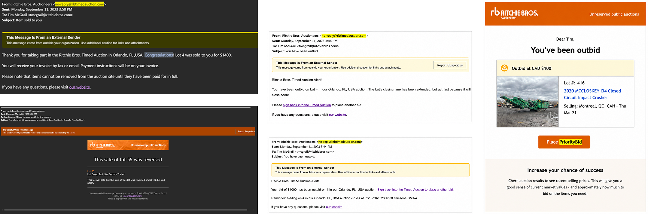
Transactional emails are an important part of the Ritchie Bros. auction experience, keeping customers informed at key moments such as when they have been outbid, won an item, or have an invoice ready to be paid. The existing emails lacked a consistent design and structure:
Inconsistent layouts, typography, and visual hierarchy
Different header, footer, and branding treatments between emails
No established design standards for transactional communications
Inconsistent experiences across email clients, devices, and screen sizes
Rather than redesigning each email individually, I created a scalable and reusable email system that established consistent design standards across Ritchie Bros. transactional communications while accounting for the technical and accessibility requirements of email.
At a glance
Consistent brand experience

Components and
patterns are reusable

Built for accessibility
and all devices

An example of the original emails:
Researching Best Practices
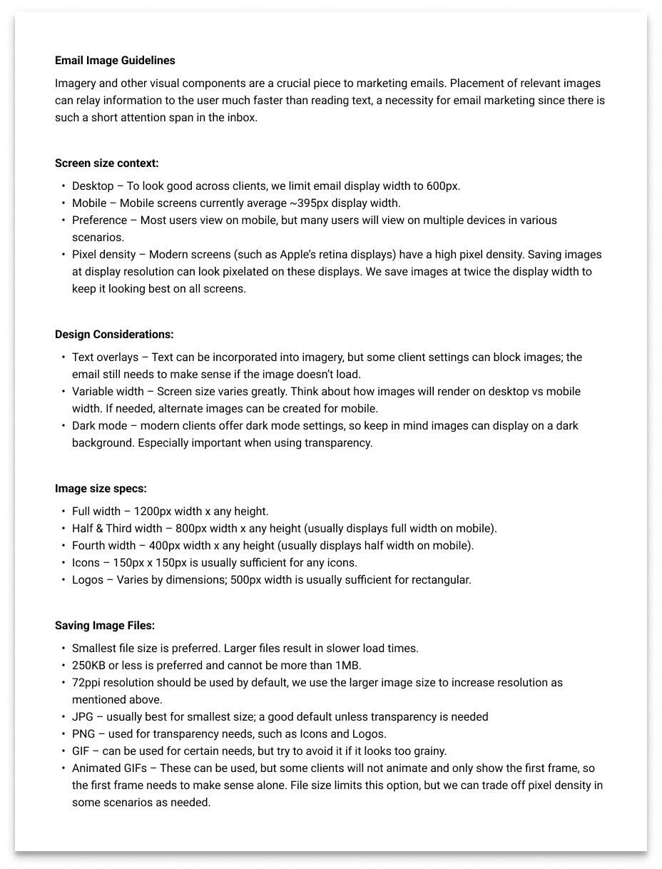
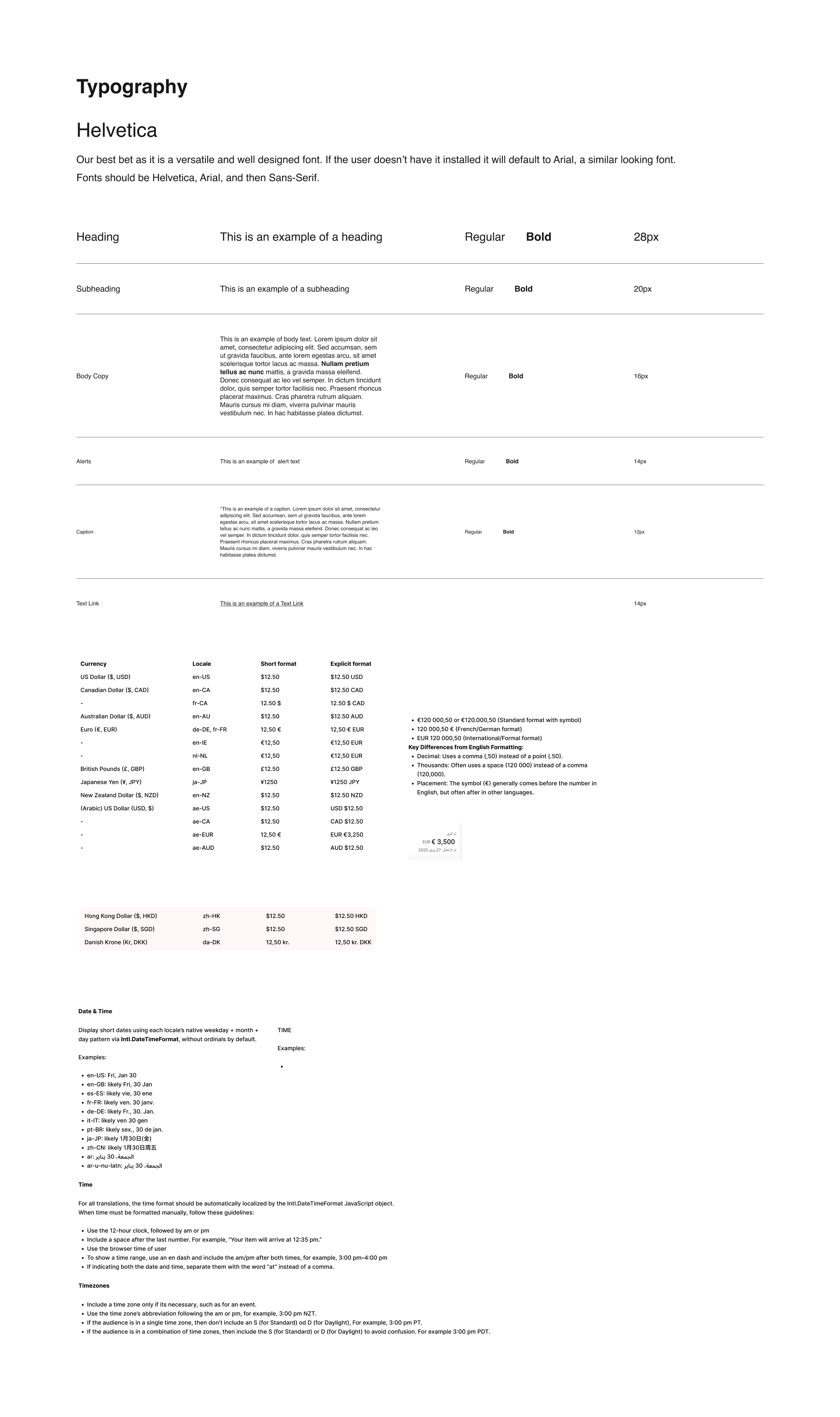
I began by researching what works and what doesn't when designing for email. With limited control over the device, screen size, and email client a customer may be using, I established a few key standards to keep the experience consistent and accessible:
600px desktop width
395px mobile design target
Single-column responsive layouts
Helvetica and system-safe fonts
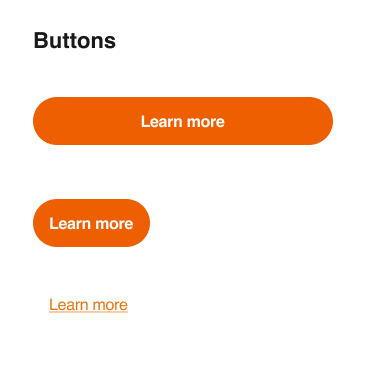
44px minimum touch targets
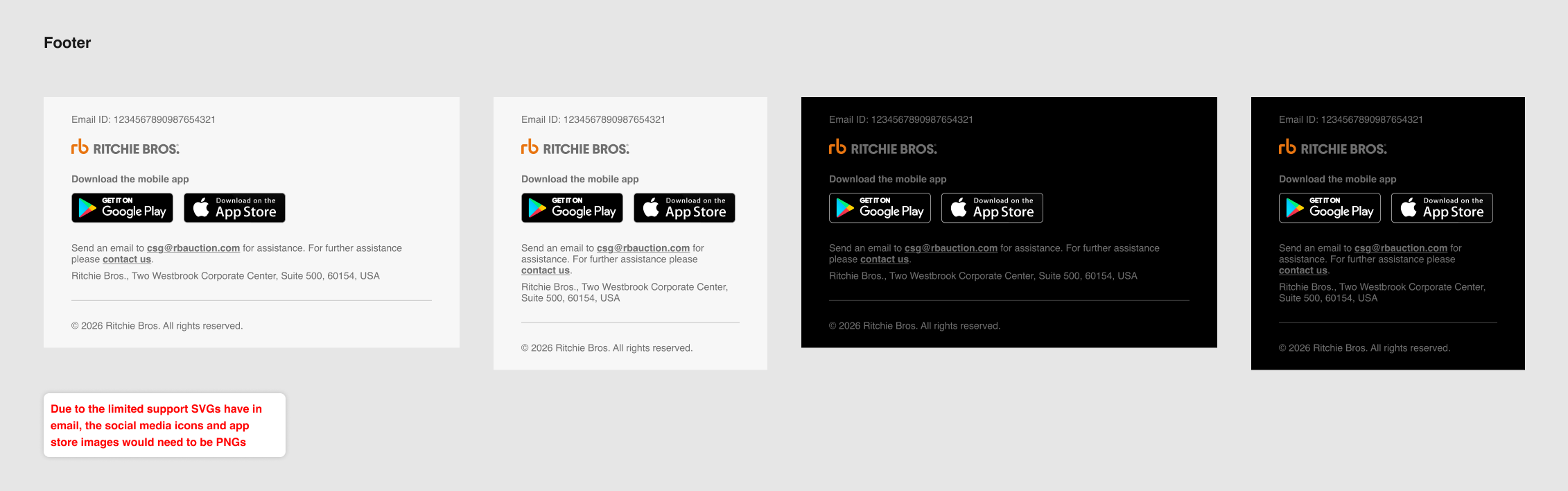
Limited CSS and no SVGs for broader email client support
Support for light and dark modes
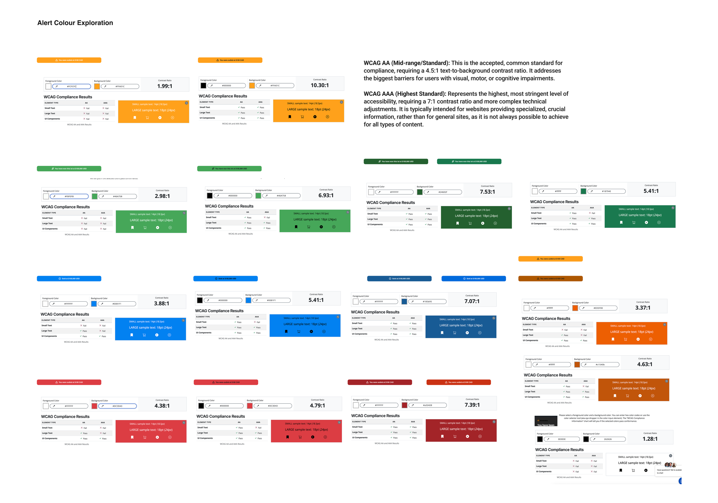
Accessible typography, contrast, and hierarchy
I also spoke with our marketing teams to better understand their existing email practices and technical considerations. I combined their knowledge with research from sources such as Baymard and AI-assisted research to further refine these standards and account for the finer details of designing for email.
Process Work
Exploration & Iteration
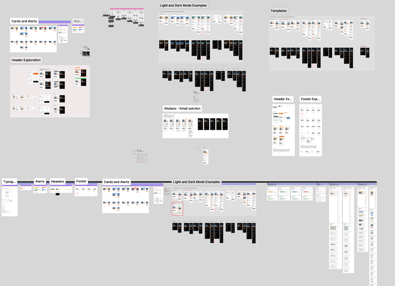
I explored different approaches through competitor analysis, wireframing, and visual design. The emails went through multiple rounds of feedback and iteration as the system began to take shape.
Testing & Refinement
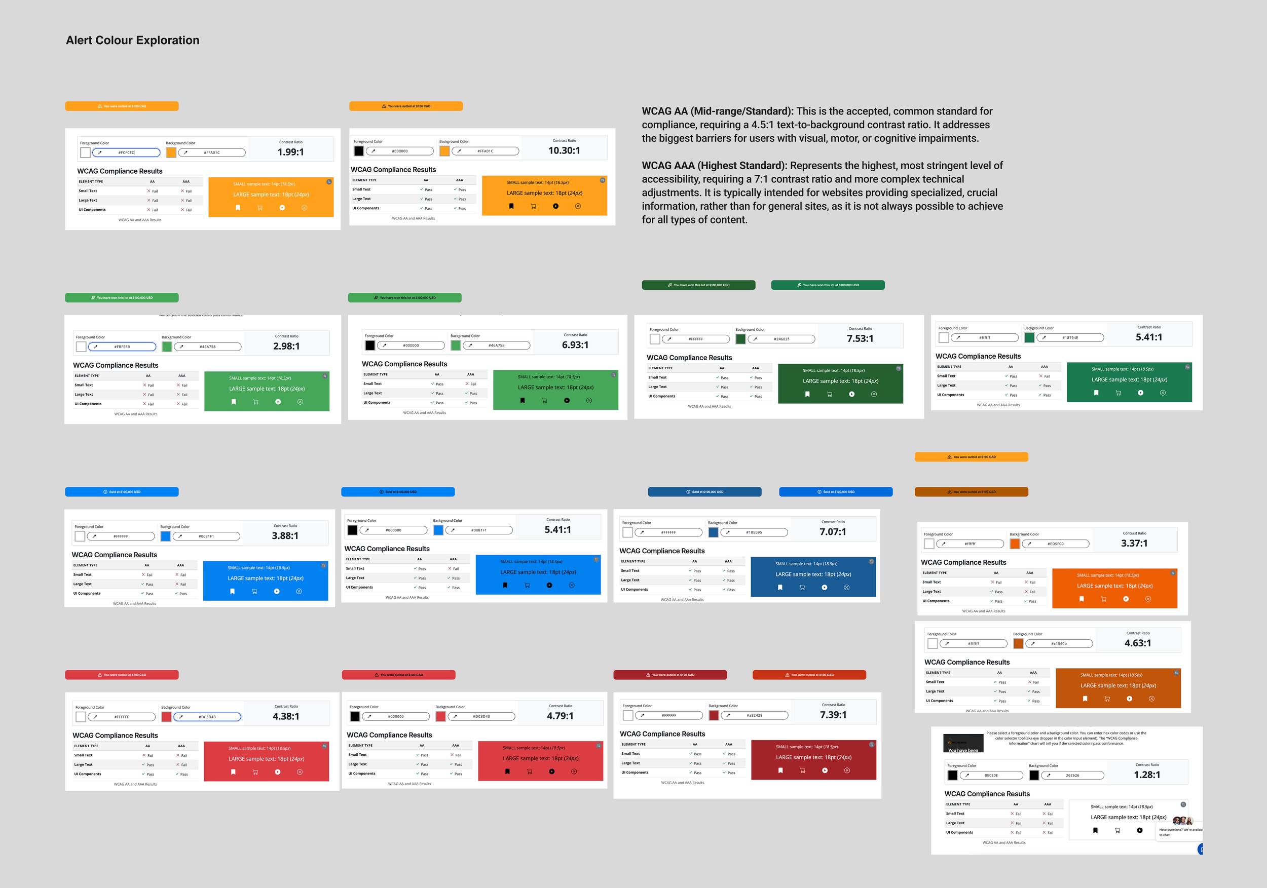
Usability testing and accessibility checks helped refine the designs, including colour contrast, hierarchy, and how information was presented across the experience.
Building for Scale
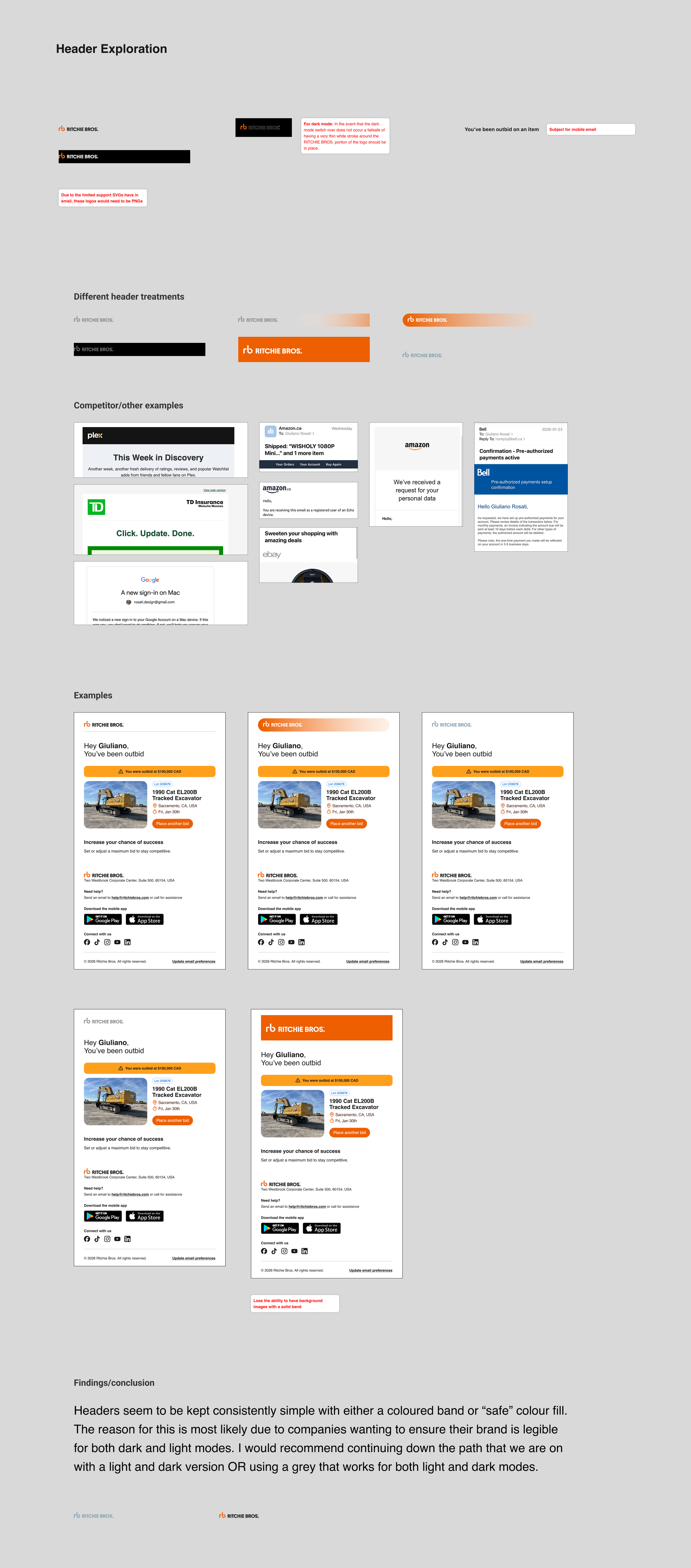
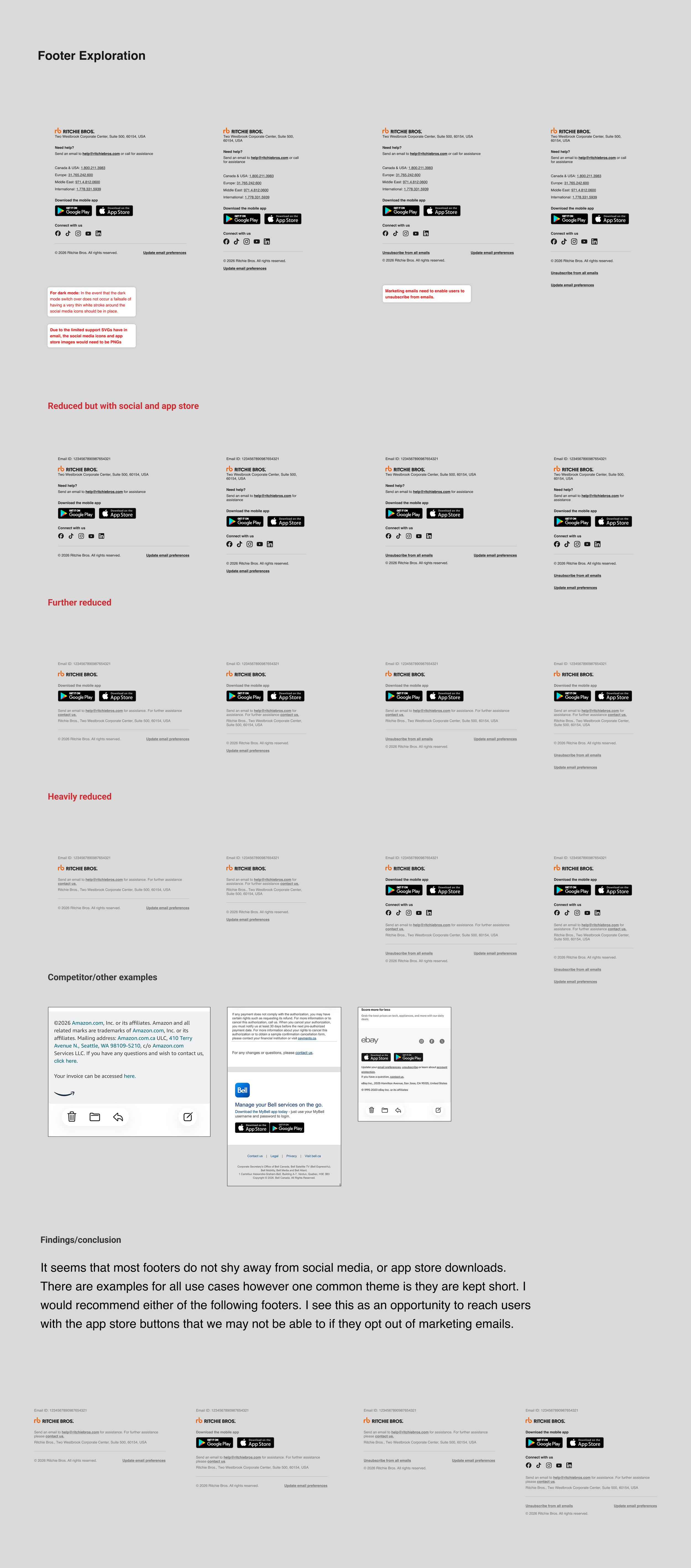
The header and footer were explored extensively to establish consistent content, branding, and support for light and dark modes. I also collaborated with our Design System Manager to document these patterns within an email-specific section of our design system.
Ensuring it all Works
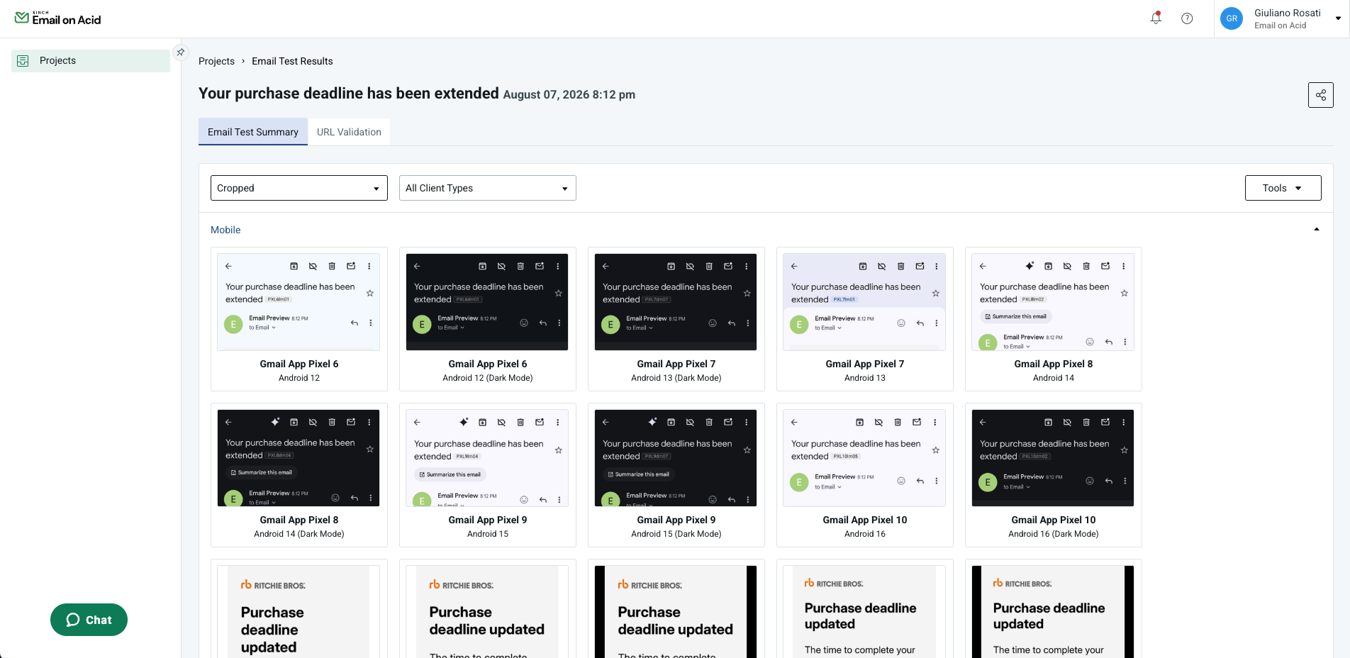
Using tools like Email on Acid I was able to ensure the emails visual integrity would remain intact across multiple email platforms and devices.
The Email System
The result was a scalable, reusable email system that could be adapted across Ritchie Bros. transactional communications. Consistent typography, spacing, headers, footers, buttons, and content patterns created a recognizable experience while still allowing each email to serve its own purpose.

You’ve been Outbid!
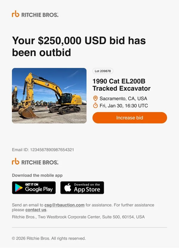
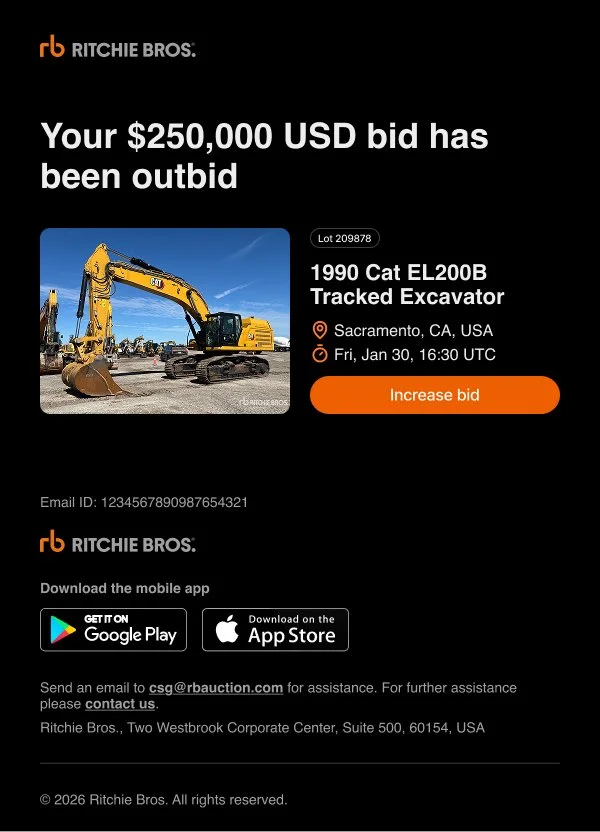
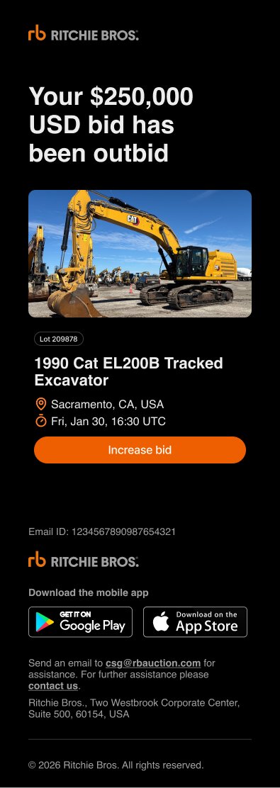
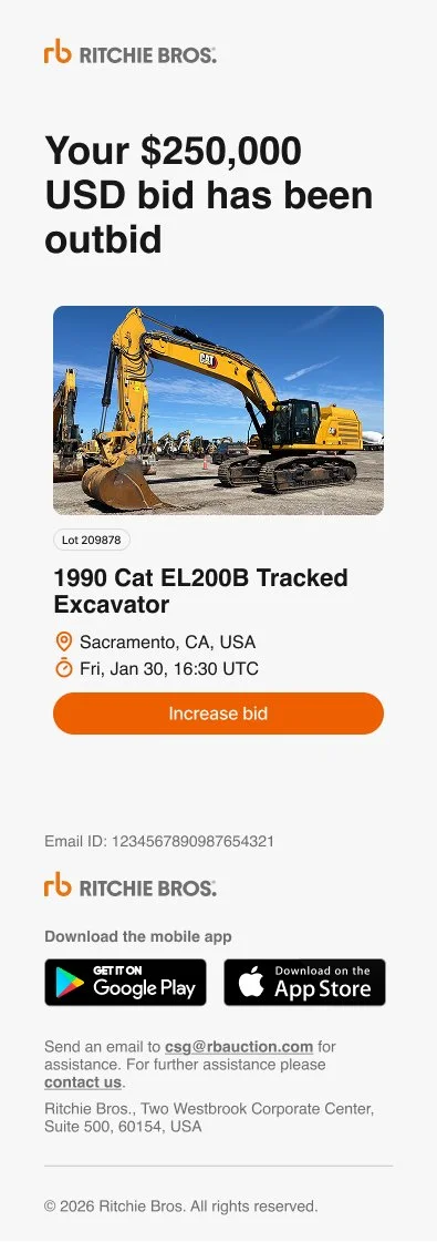
The Outbid email was one of the first opportunities to put the new system into practice. The goal was simple: clearly tell customers they had been outbid, provide the information they needed about the item, and give them an immediate way to get back into the auction.
The redesigned email creates a clear hierarchy around the current bid, item details, and a prominent Increase Bid call to action, while adapting the new system across desktop, mobile, light, and dark modes.
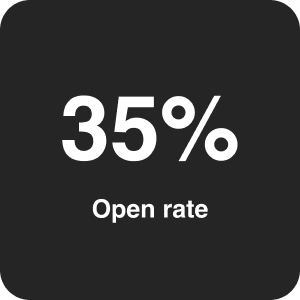
35% Open rate
75% session to bid conversion rate
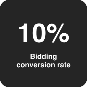
10% bidding conversion rate across all sends.
Following the launch of the redesigned Outbid email.
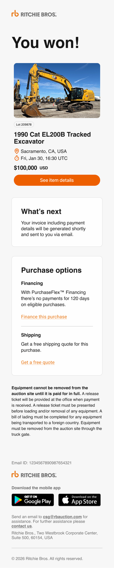
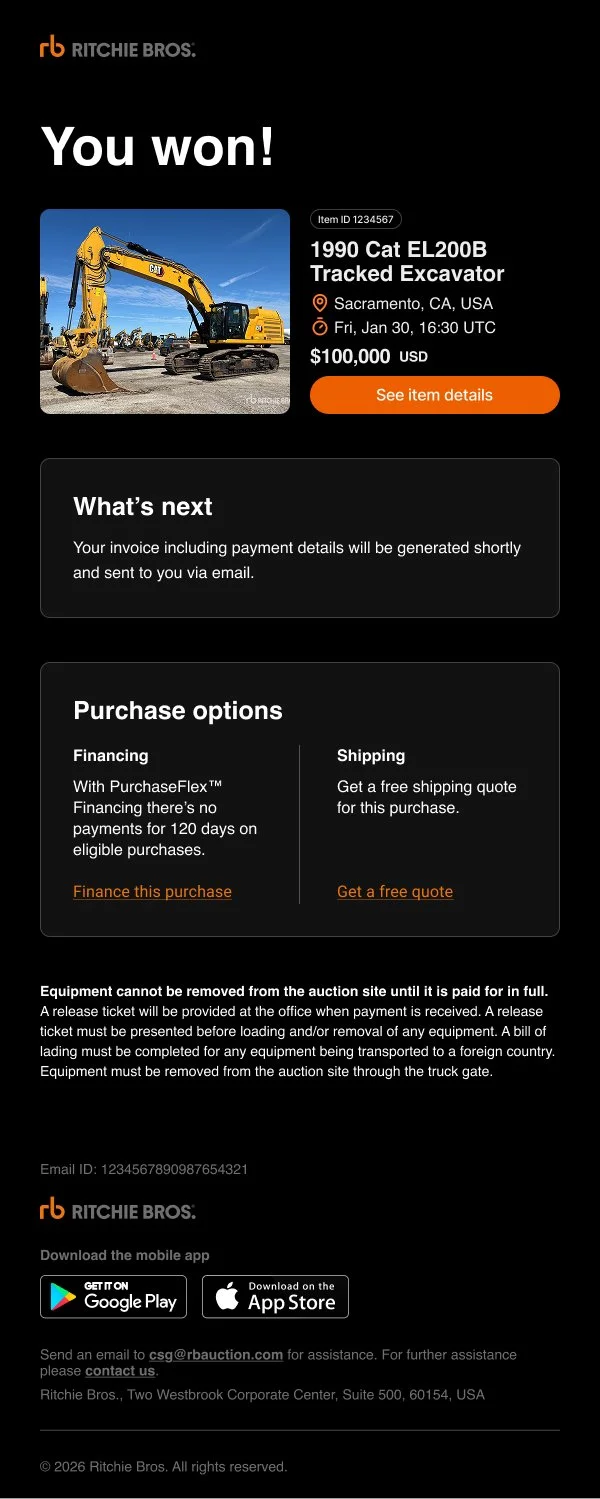
You’ve Won!
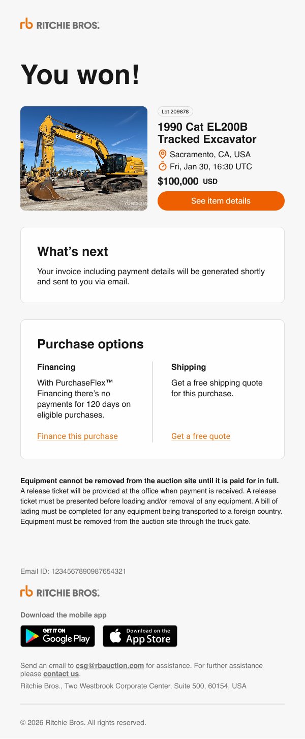
Winning an item is a very different moment in the auction journey. The experience needed to clearly communicate the win while also creating a sense of excitement for the customer. Celebratory messaging and confetti were introduced while keeping the item and purchase details easy to scan.
The email also presented an opportunity to support the business and help customers simultaneously. Financing and VeriTread shipping options were incorporated into the experience, giving customers relevant next steps while creating additional opportunities for Ritchie Bros. Later on the email was simplified and we removed the confetti as well as other visual distractions like the VeriTread logo to keep the user focused.
Although visually distinct from the Outbid email, the design still follows the same underlying email system, including typography, spacing, responsive behaviour, accessibility, light and dark modes, and the established header and footer.

Results
The new system established a consistent and scalable foundation for Ritchie Bros. transactional emails, making it easier to design future communications while maintaining the same standards across each experience.
More importantly, this work went beyond individual email designs by giving Ritchie Bros. a reusable framework that can support new transactional communications as the business and its needs continue to grow.
Several additional emails, including You Won, are still moving through implementation and approval, so further performance data is not yet available.
The redesigned Outbid email has also shown a meaningful increase in customer engagement since launch, with the the following stats:
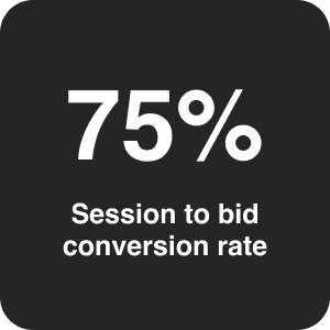
75% of sessions generated by users who clicked/opened the outbid email resulted in the user placing another bid.